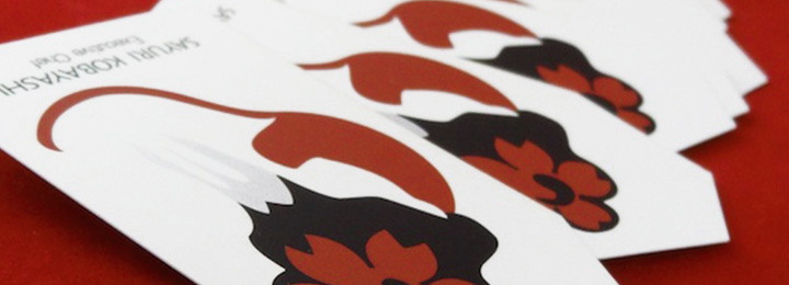
Unedited photos from two sessions that were used in the making of the print ads…
Lemmy Lemonade Refreshed
[one_half] [/one_half]
[one_half_last]
[/one_half]
[one_half_last]
[one_half]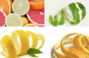 [/one_half]
[one_half_last]
[/one_half]
[one_half_last]
[one_half] [/one_half]
[one_half_last]
[/one_half]
[one_half_last]
[/one_half]
[one_half_last]
The Original
Lemmy Sparkling Lemonade packaging is currently still using the original 1935 branding.
My Reasoning
Even though it is a very tasty drink, the drooling lemon mascot doesn’t doesn’t make me crave it. (I think the logo is creepy. Sorry!) I liked the challenge to update the brand while still paying homage to it’s retro roots. Since Lemmy Lemonade uses natural juices I thought it would also be nice to also expand it’s product line to encompass more citrus flavors.
[/one_half_last][one_half]
[/one_half]
[one_half_last]
The Main Idea
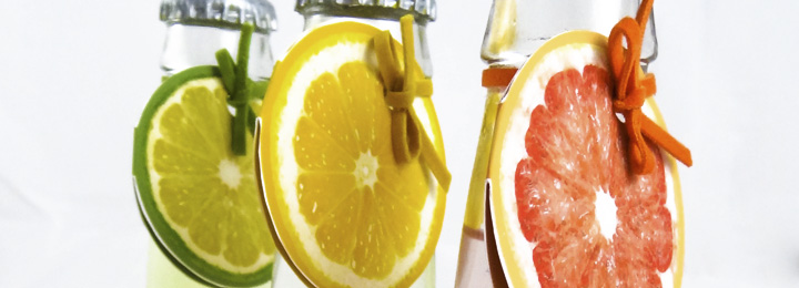
The rebranding is based on a playful attitude that aims towards the inner child in every adult. I focused on bright colors such as yellow, pink, and green seen in citrus fruits of lemon, lime, and grapefruit. The overall feeling for the redesign is based off peeling a fresh piece of fruit in the summer as a kid.
[/one_half_last][one_half]
[/one_half]
[one_half_last]
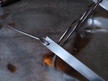
Repurposed Carrier
To accomplish an “old fashion” feel, I repurposed a vintage soda bottle carrier. The packaging should be strong and reusable. I removed all the signage and sanded most of the rust off before spraying it silver. I even cut new piece of wood (all by myself!) for the bottom since the original piece was beyond salvaging.[/one_half_last]
[one_half]Before
 [/one_half][one_half_last]After
 [/one_half_last]
As I was putting my ideas into fruition (haha), I was really attached to the idea of “freshly squeezed”. I wanted the logo to look like juice pouring/droplets, and be thin, handwritten, and elegant.
My design first revolved around a thick, textured, peel-like shape around the neck of the bottle and citrus slices working as the nutrition label on the back and to be seen at sliced fruit when the juice is drunk.
My first concepts used a wider color pallete of contrasting colors for interest but later simplified because of inconsistency and legibility.
Bottle carrier concepts. Although here they seen nicely it was not easy to craft. The case was originally bought but I had to spray paint over rust, cut wood and put it together all again. When creating the bottom right case, it started to feel very clunky and not as whimsical as the illustrated version. Also I didn’t like how the case was starting to hide the overall design rather than enhance it. The large covered areas felt bare as I didn’t have illustration/pattern/text to fill the voids. I’m currently trying to resolve the issues I’m having with it.
The final design of the bottles I settled on. All the text is white and focused on the natural colors of the juice rather than contrasting with colored text. The slices remain inside and on the back but I removed the texture element because it sacrificed legibility.
| My design first revolved around a thick, textured, peel-like shape around the neck of the bottle and citrus slices working as the nutrition label on the back and to be seen at sliced fruit when the juice is drunk. My first concepts used a wider color pallete of contrasting colors for interest but later simplified because of inconsistency and legibility. | Bottle carrier concepts. Although here they seen nicely it was not easy to craft. The case was originally bought but I had to spray paint over rust, cut wood and put it together all again. When creating the bottom right case, it started to feel very clunky and not as whimsical as the illustrated version. Also I didn’t like how the case was starting to hide the overall design rather than enhance it. The large covered areas felt bare as I didn’t have illustration/pattern/text to fill the voids. I’m currently trying to resolve the issues I’m having with it. |
Related Posts